In the rapidly evolving field of UI design, staying updated with the latest tools is essential. As we progress through 2025, several UI component libraries have emerged as game-changers, offering designers enhanced efficiency, customization, and accessibility. This article explores five standout libraries—HeroUI, Shadcn UI, DaisyUI, FloatUI, and Uiverse—highlighting their key features, advantages, and potential drawbacks to help you determine the best fit for your projects.
1. HeroUI
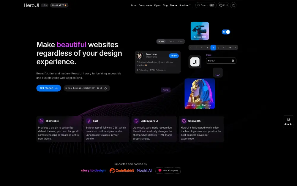
Overview: HeroUI is a React-based UI library built atop Tailwind CSS and React Aria, designed to streamline the development of beautiful and accessible user interfaces.
Pros:
- Full TypeScript Support: Offers a fully-typed API, ensuring type safety and a smoother developer experience.
- Customizable Theming: Provides a custom Tailwind CSS plugin, allowing for easy theme customization or creation.
- Automatic Dark Mode Recognition: Adapts to HTML theme property changes for seamless dark mode integration.
Cons:
- React-Specific: Designed exclusively for React, limiting use with other frameworks.
- Learning Curve: New users may need time to familiarize themselves with its integration of Tailwind CSS and React Aria.
2. Shadcn UI
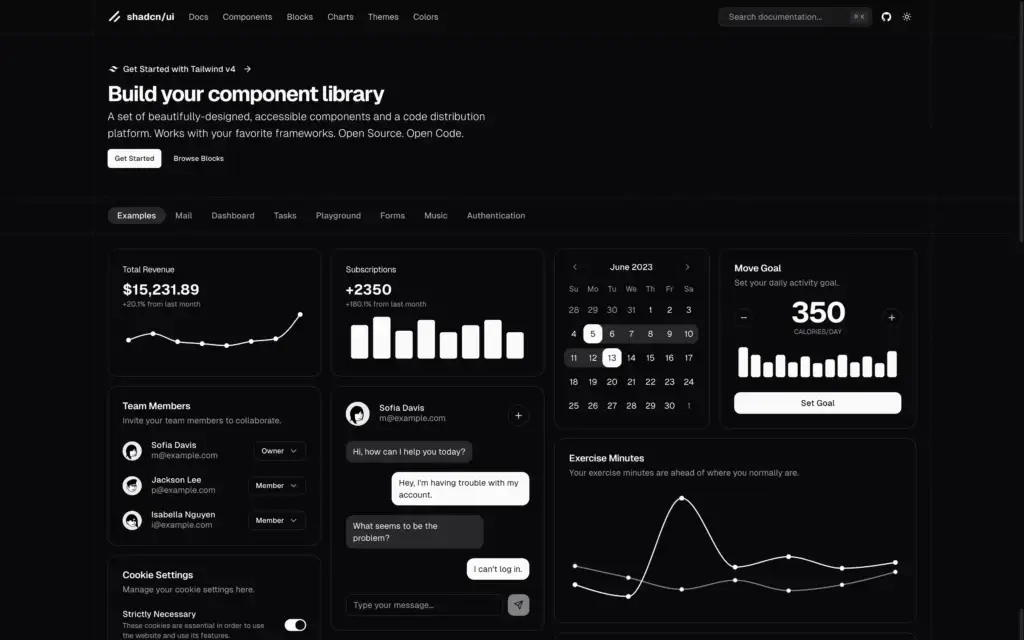
Overview: Shadcn UI is a modern component library that combines Tailwind CSS and Radix UI, focusing on simplicity, speed, and accessibility.
Pros:
- Ease of Use: Accessible to those with basic knowledge of HTML, CSS, JavaScript, and frameworks like Next.js.
- Accessibility: Components adhere to Web Content Accessibility Guidelines (WCAG), supporting screen readers and keyboard navigation.
- Customization: Direct access to component source codes allows for extensive customization.
Cons:
- Manual Maintenance: Components are copied into your project, requiring manual updates and maintenance.
- Tailwind CSS Dependency: Effective use necessitates familiarity with Tailwind CSS.
- Potential Bundle Size Increase: Including components directly can lead to larger bundle sizes if not managed properly.
3. DaisyUI
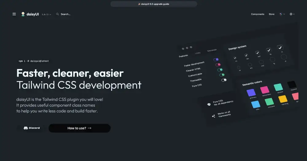
Overview: DaisyUI is a Tailwind CSS plugin that offers a set of semantic component classes, simplifying the creation of responsive and consistent UI components.
Pros:
- Time-Saving: Pre-built components reduce the need to style from scratch, accelerating development.
- Uniform Design: Ensures consistency across UI components.
- Responsive Design: Components are designed to adapt to various screen sizes.
Cons:
- Limited Customization Outside Themes: Advanced or unique designs may require overriding default styles.
- Tailwind CSS Dependency: Primarily beneficial for developers already using Tailwind CSS.
- Learning Curve: New users unfamiliar with Tailwind CSS may need time to adapt.
4. FloatUI
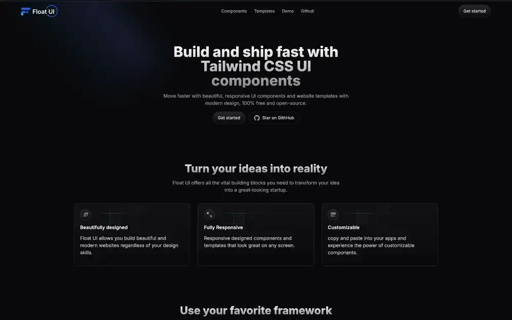
Overview: FloatUI is a free, open-source collection of Tailwind CSS UI components and templates designed to expedite the creation of modern, responsive websites.
Pros:
- Beautiful and Responsive Components: Offers a range of aesthetically pleasing, fully responsive components.
- Framework Compatibility: Easily integrates with popular JavaScript frameworks like React and Vue.js.
- Customizability: Components can be tailored to fit specific project needs.
Cons:
- Tailwind CSS Knowledge Required: Effective use requires familiarity with Tailwind CSS.
- Limited Advanced Features: May lack some advanced functionalities found in more comprehensive UI libraries.
5. Uiverse
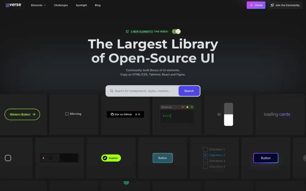
Overview: Uiverse is an extensive open-source platform offering a vast library of community-created UI elements made with CSS and HTML, facilitating the creation of unique and interactive user interfaces.
Pros:
- Extensive Library: Hosts thousands of free, community-contributed UI elements.
- Community Engagement: Active community with continuous contributions and updates.
- Ease of Use: User-friendly interface with easy integration of UI components.
Cons:
- Overwhelming Variety: The vast number of options might be daunting for new users without guidance.
- Quality Variability: As a community-driven platform, the quality of components can vary.
- Limited Advanced Features: Some advanced functionalities found in paid tools might be missing.
Incorporating these UI component libraries into your projects can significantly enhance development efficiency and design quality. However, it’s essential to consider each tool’s strengths and limitations to determine the best fit for your specific needs.