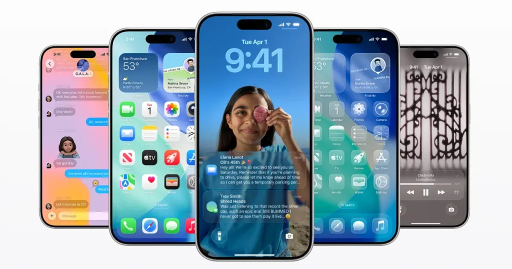
Apple’s new “glassy” design is flashy. It looks slick, modern, and almost futuristic—like holding a little piece of sci-fi in your hand. But once you actually use it, the shine wears off. The problem? Readability and usability take a backseat.
Cool to Look At, Hard to Read
I’ve always kept my phone in dark mode. Even before Apple officially added it, I’d keep my screen at the lowest brightness because of my light sensitivity. At night, it’s the only way I can use my phone without straining my eyes.
That’s why the new glassy design feels like such a mismatch. The blurry transparency and subtle contrast might look great in marketing shots, but in real life, it makes text harder to read. Instead of helping, it makes the screen feel busier and less clear.
Vista Vibes All Over Again
People compare this style to Windows Vista—and I can see why. Back then, the glass effect felt new but quickly showed its flaws. The funny part is, today’s displays are way better. They can handle bold and sharp designs easily. Yet Apple is doubling down on a look that’s stylish, but not practical.
Apple’s Distraction Play?
Here’s the thing: Apple is clearly behind when it comes to AI. Every other big tech company is racing ahead, and Apple doesn’t really have much to show yet. So what do they do? They roll out a design that gets people talking. It’s a distraction—a way to make headlines about how “fresh” the UI looks, even if it’s not actually improving the user experience.
It reminds me of the Apple Mouse. It’s clean, minimal, and looks great on a desk. But flip it over and you realise you can’t use it while it’s charging. Classic Apple: beautiful design that falls apart in real-world use.
In the End
Don’t get me wrong—the glassy design is nice to look at. But after a while, you start noticing the flaws. For someone like me, who already struggles with bright screens, it just makes things worse.
Apple used to be about making products that just worked. Now, it feels like they’re more focused on keeping up appearances than on making their devices more usable. And until they catch up in AI, design might be the only thing they can really lean on to keep people talking.