From Problem to Solution: Creating Arebos DE’s Return Portal
A self-service returns portal, designed from scratch and shipped in 20 days. Customers start returns, replacements or refunds themselves, and the warehouse routes every item with photo evidence.

- Role
- UX Designer
- Timeline
- Sep – Nov 2024 (20 days to launch)
- Context
- Arebos DE · Customer returns portal + B2B warehouse back-end
Arebos DE had a manual, confusing returns process. I designed a self-service returns portal from scratch, covering the customer-facing interface and the B2B warehouse back-end, and shipped it in 20 days.
Results
Zero to launch in 20 days
Designed and shipped the customer-facing returns UI and the B2B warehouse back-end, end to end.
Support taken out of the loop
Returns moved from email to self-service, and automatic eligibility checks stopped invalid returns before they were submitted, cutting support tickets and calls.
Fewer fraudulent claims
Mandatory photo evidence settled “damaged goods” disputes and gave the warehouse eyes on each product before it arrived.
Returns turned into revenue
A visual routing system lets warehouse staff send functional returned goods straight to the shop’s “Refurbished” section for immediate resale.
Problem & approach
The manual product-return process was a significant challenge. Without a streamlined, intuitive system, customers were confused, negative feedback online increased, customer-support call volumes were high, and the warehouse was inefficient.
Existing data showed clear user pain points and common issues, so I took a UX-driven approach and designed an intuitive, user-friendly return portal entirely from scratch. The main objective was simplicity, so people could move through the process effortlessly.
Process
Understand
Collaborative sessions with stakeholders and internal teams to understand the operational challenges and user pain points.
Structure
Detailed user flowcharts and a clear, intuitive information architecture to simplify navigation.
Start a return
An easy interface to start a return, replacement or refund with just an invoice and order number.
Document the issue
Intuitive photo upload for effortless documentation of product issues.
Check eligibility
Automatic eligibility checks, clearly communicated, so users know instantly whether a return or replacement is possible.
Ship it back
A user-centred PDF and QR-code generation step for straightforward product returns.
Test
Extensive internal usability testing, so the final design reduced frustration for customers and warehouse staff alike.
User flow
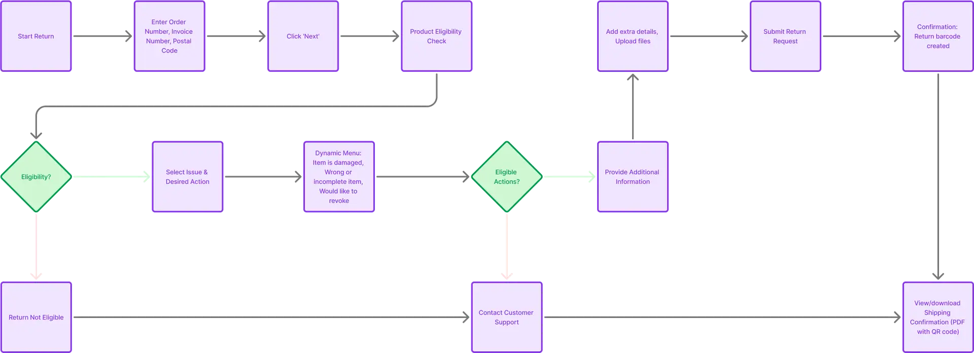
The flow below shows the happy path and the exits: a failed eligibility check ends in a clear “not eligible” state, and edge cases route to customer support. Select the image to see it full size.
Key insight
Simplicity changed the whole operation
The project showed the power of UX-driven simplicity. By focusing entirely on a clean, intuitive experience built from the ground up, the solution transformed customer interactions and significantly streamlined operational workflows.