Nuasol – Solar Panel Energy Monitoring App
A real-world app that lets DIY solar-panel owners monitor energy production in real time, manage multiple panels and see their savings, designed for homeowners in Germany, Switzerland and the EU.

- Role
- Lead Researcher & Designer
- Timeline
- 3 months (Agile Scrum)
- Tools
- Figma, paper sketching
- Context
- Real-world app · Germany, Switzerland, EU
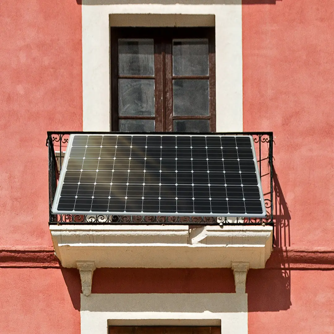
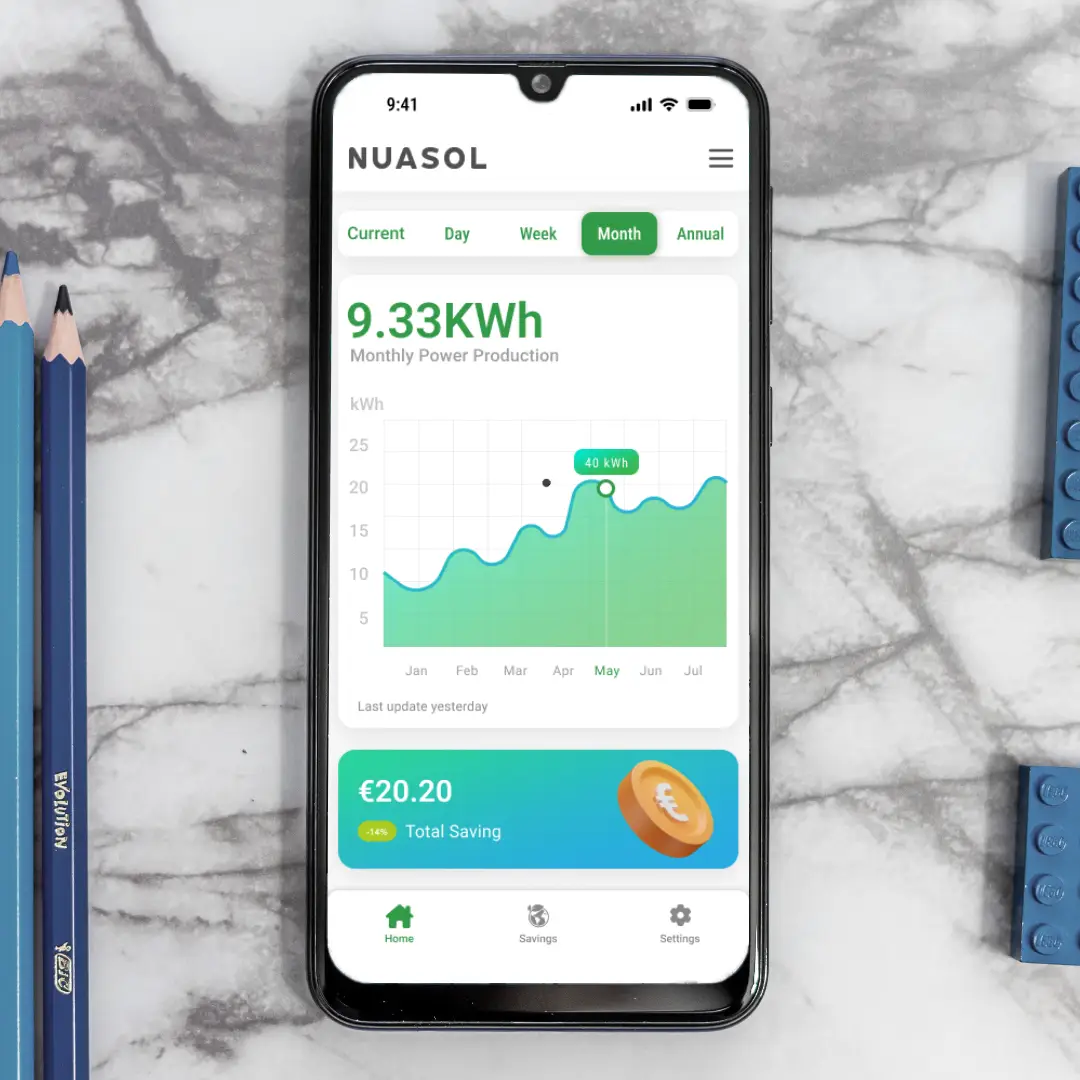
Nuasol is a real-world app that lets DIY solar-panel owners monitor their energy production in real time. It is built for homeowners and small business owners in Germany, Switzerland and across the EU, and it connects directly to Nuasol solar panels and inverters.
Overview
Nuasol helps users track and manage their renewable energy production and consumption. With real-time insights, smart notifications and clear analytics, solar owners can optimise efficiency, reduce costs and maximise savings.
What the app does
- Monitors real-time solar energy production
- Manages multiple PV panels across different locations
- Sends alerts and notifications about system health and energy insights
- Estimates cost savings and energy consumption trends
- Guides users through inverter setup for easy installation
My role
- Lead researcher & designer: UX/UI design, content creation and testing
- Part of a core team of three: two developers and me
- Worked in Scrum with daily meetings, and with stakeholders and German colleagues as the project progressed
The challenge
DIY solar-panel owners were stuck with outdated, buggy, installer-dependent apps such as PV Master that offered no real-time data. People were confused by complex installation and had no insight into how much they were saving.
Make Nuasol truly DIY-friendly: replace technical jargon with guided setup, give real-time feedback, and show cost savings in clear visuals.
Research
Discover & Define
Stakeholder interviews and market research led to clear personas and a defined product direction.
Ideate & Design
We translated goals into wireframes and high-fidelity screens using an agile development process.
Test & Launch
We validated the design with real-user testing before preparing assets for the final app-store launch.
Competitive analysis
I looked at what already exists to see where current apps fall short and where Nuasol could stand out.
PV Master
- Technical access for Growatt devices
- A basic calculator
- Outdated and buggy
- Crashes often
- Poor user experience
NEPViewer
- Works with NEP devices
- Allows data monitoring
- Buggy login and the password is not hidden
- Asks for unnecessary sign-up info
- No feedback or alerts
FranklinWH
- Full home energy monitoring
- Smart appliance control
- Clean design
- Requires Franklin hardware
- Not DIY-friendly
Who I designed for
I created 5 personas to understand users’ worlds and needs. Two of them are shown here.

Alex Müller
Alex recently installed a DIY solar panel system. He wants to reduce electricity costs and optimise energy usage, and enjoys reading about renewable energy and testing smart-home automation.
- High electricity bills
- Inefficient energy usage
- Lack of real-time solar data
- Reduce electricity costs
- Track solar energy in real time
- Maximise energy efficiency

Emma Schmid
Emma uses solar panels to cut electricity costs. She is busy running her business and needs a simple way to monitor energy production; she prefers apps that are easy to use.
- Unpredictable electricity costs
- Difficulty managing energy consumption
- No time to monitor solar performance
- Optimise energy use for the café
- Receive alerts for maintenance
- Easily track solar panel efficiency
Ideation
Storyboard: the big picture
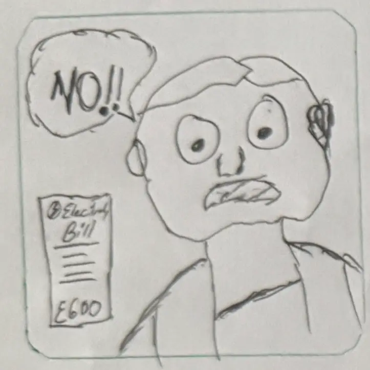
A homeowner in Germany decides to reduce electricity bills by installing a solar panel system.
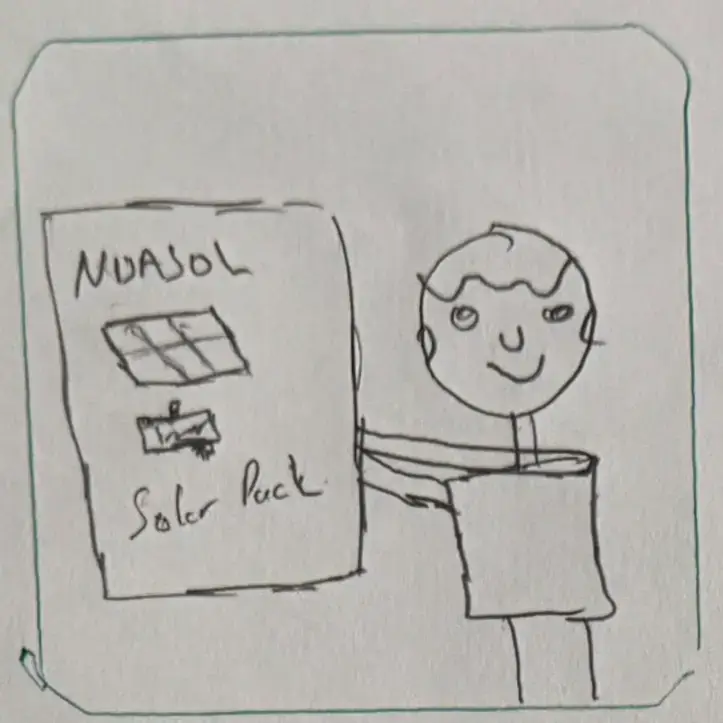
They buy several Nuasol panels and inverters to generate solar energy for their home.
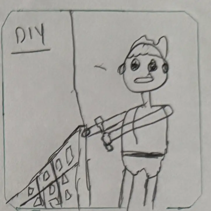
They follow the installation steps, set up two panels and the inverter, and wait for the Wi-Fi light to turn on.
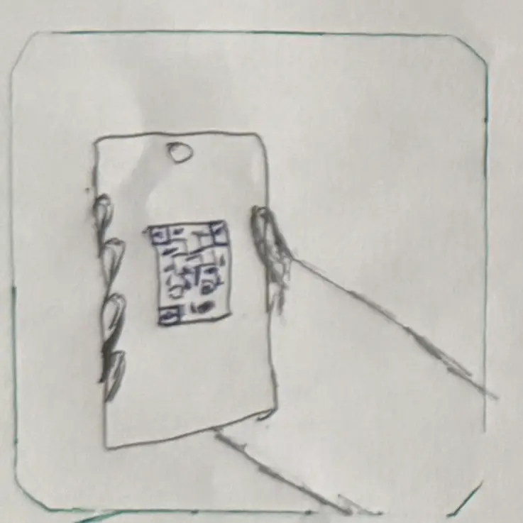
After installing, they add each panel to the Nuasol app and link it to their account for central monitoring.
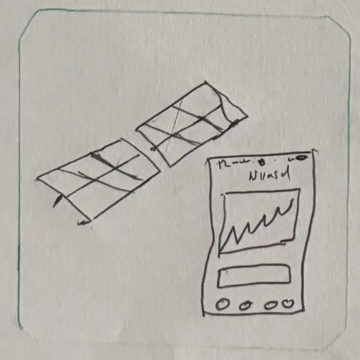
They use real-time data to adjust power usage, charging their laptop, phone and DIY equipment from the panels.
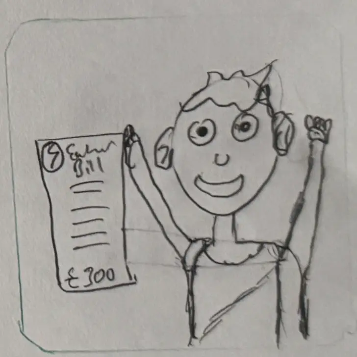
Over time they use less grid electricity, see the benefit on their bills and reduce their CO₂ footprint.
Storyboard: close-up
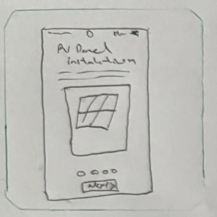
The user takes the app’s walkthrough and installs the panels.
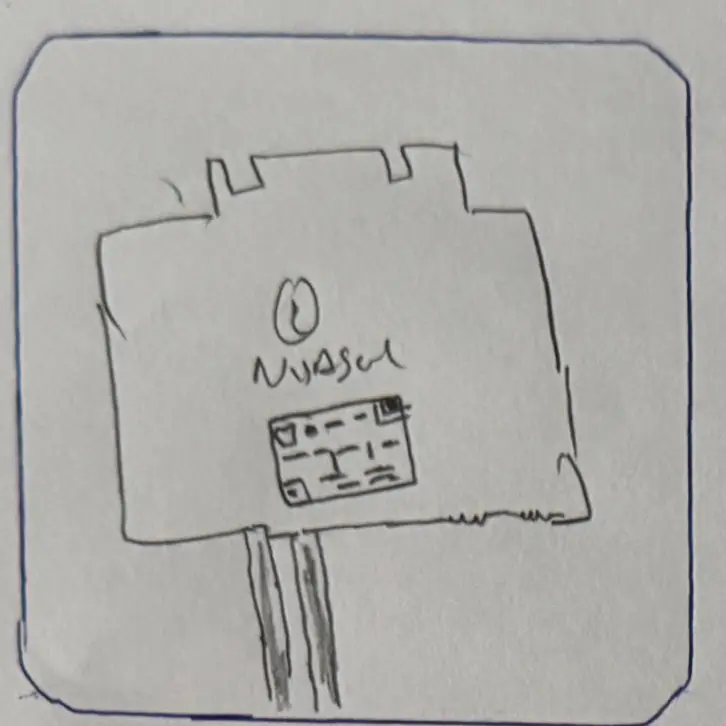
They scan the QR code on the inverter and the app opens the installation process for their model.
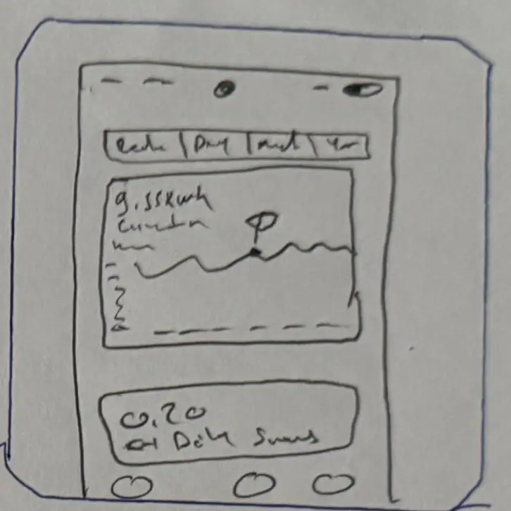
The app shows the power production of each solar panel.

Users can track and compare several solar panel installations to improve efficiency.
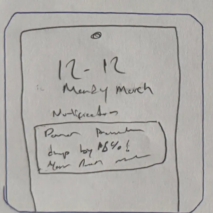
Instant notifications about system faults, weather conditions and maintenance reminders.
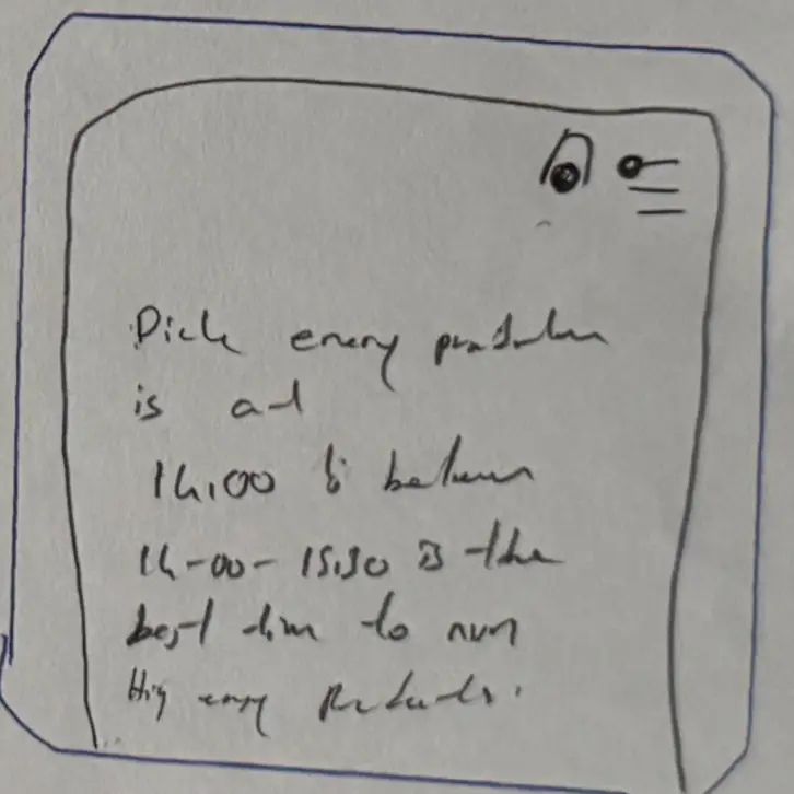
Peak production times help users schedule energy-heavy appliances efficiently.
User flow
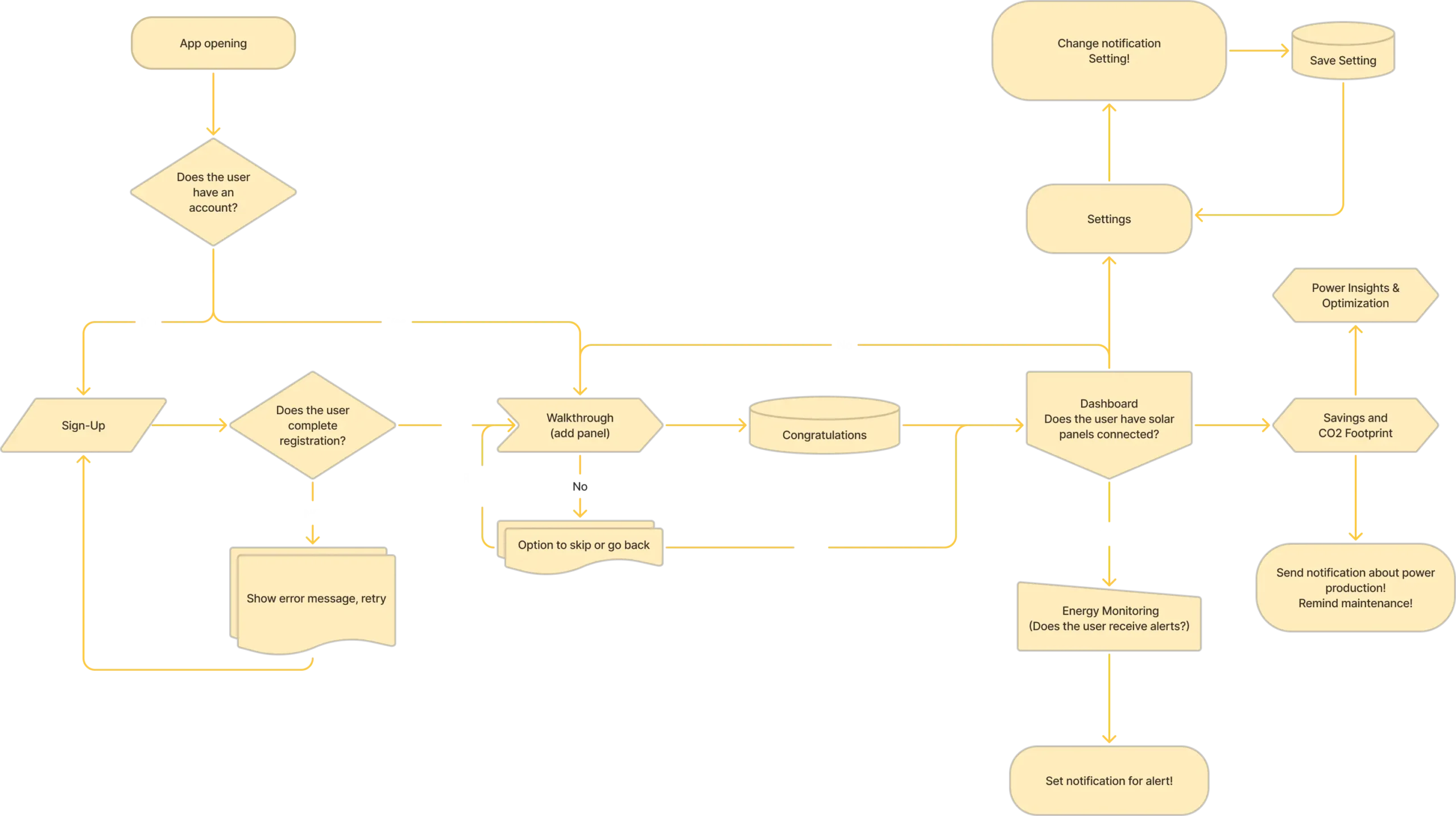
I mapped the steps a user takes to get a task done in Figma. This helped me trace the journey, spot potential pain points and optimise the experience, alongside the competitor research above.
Design
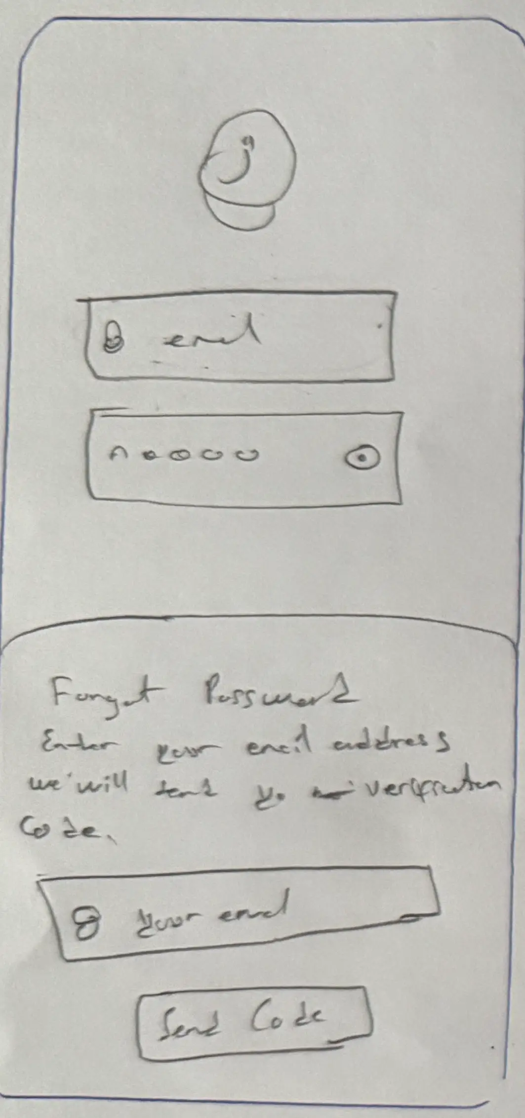
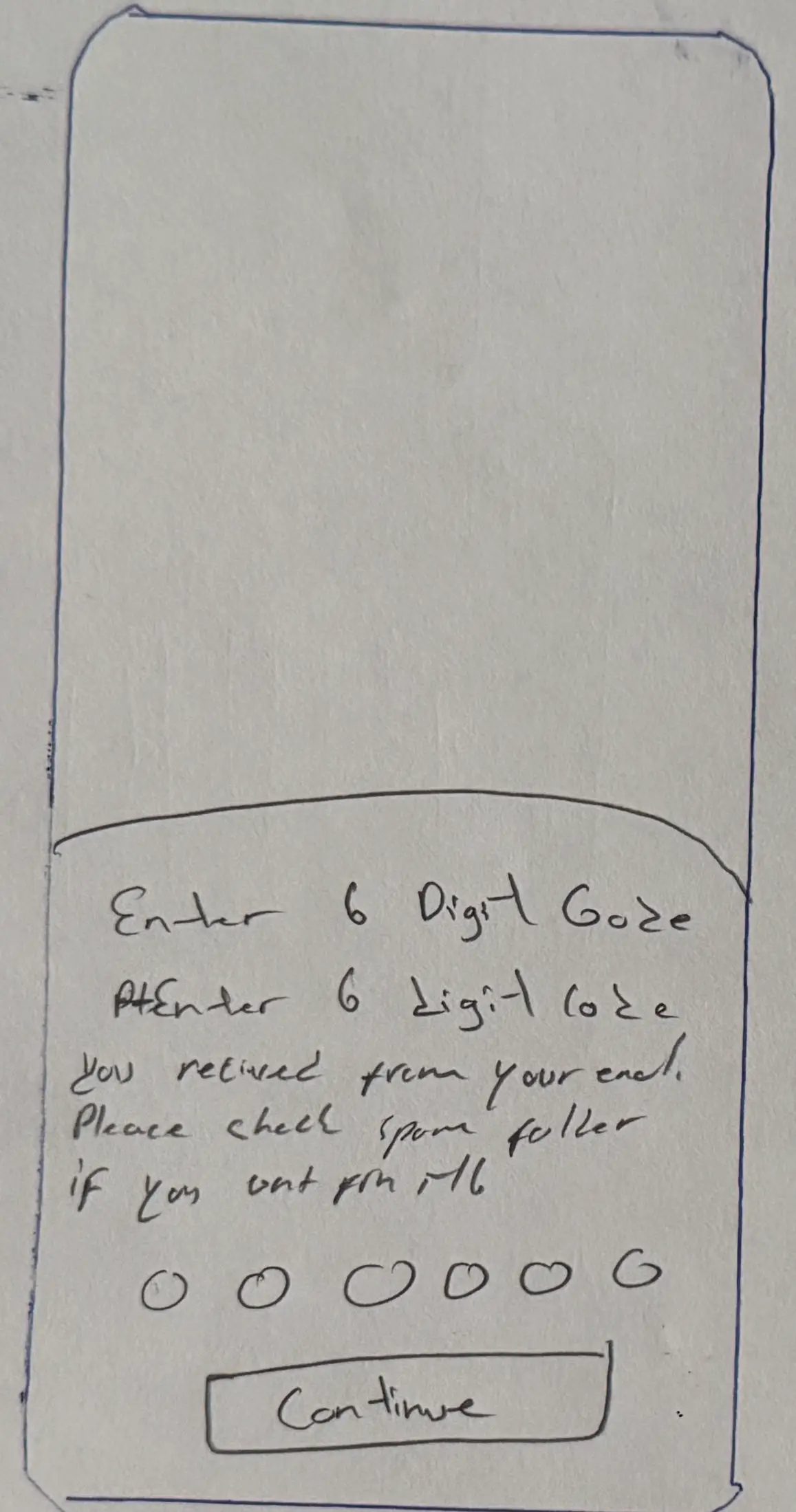
Paper wireframes
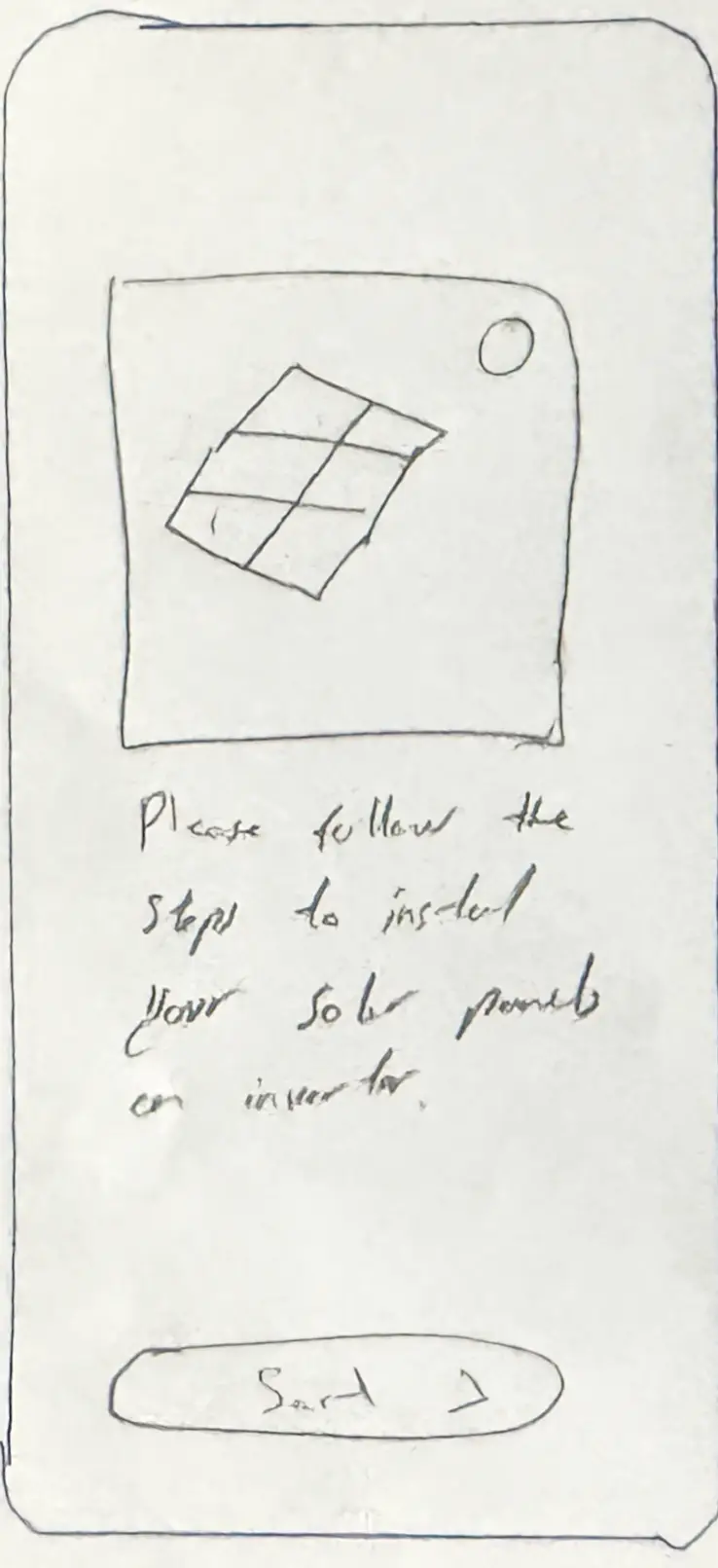
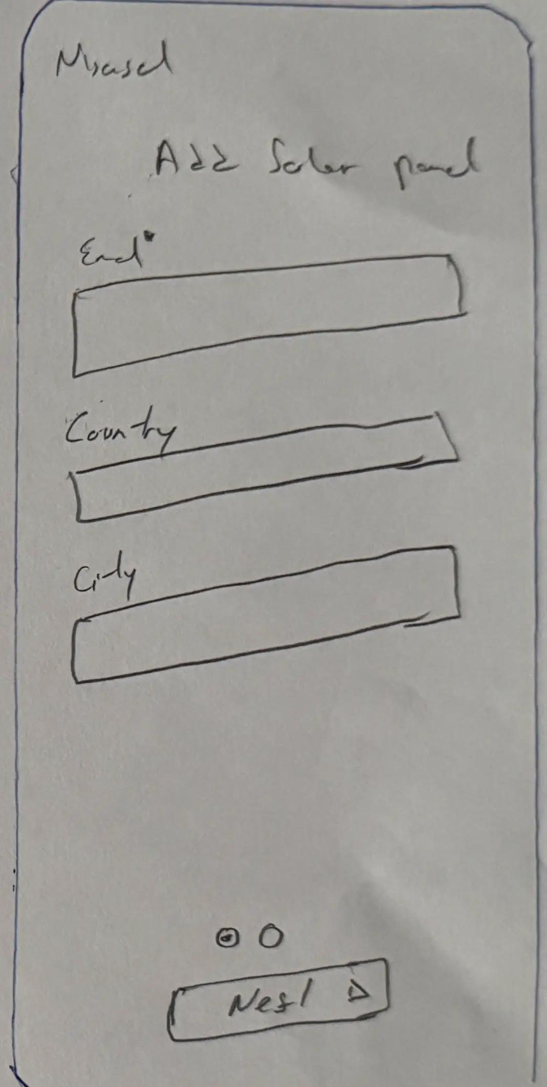
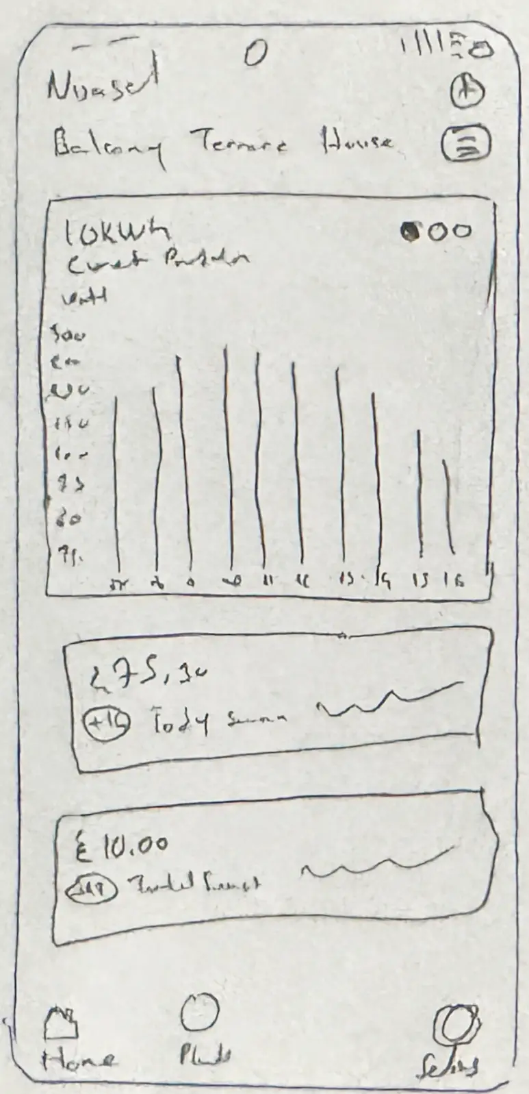
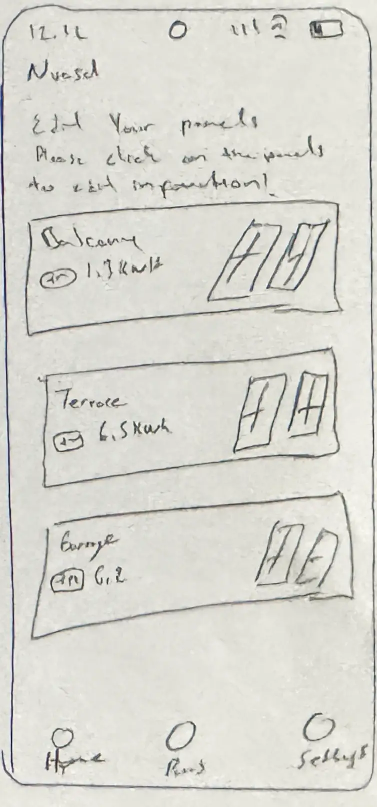
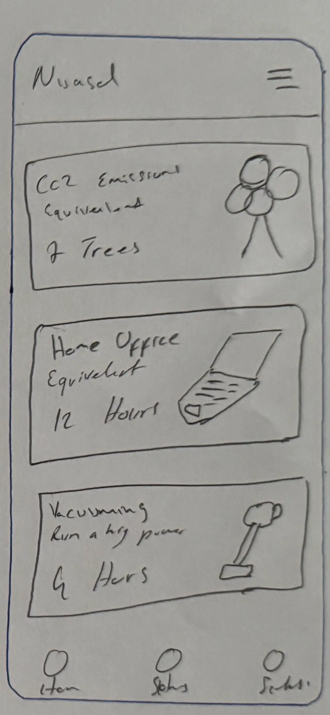
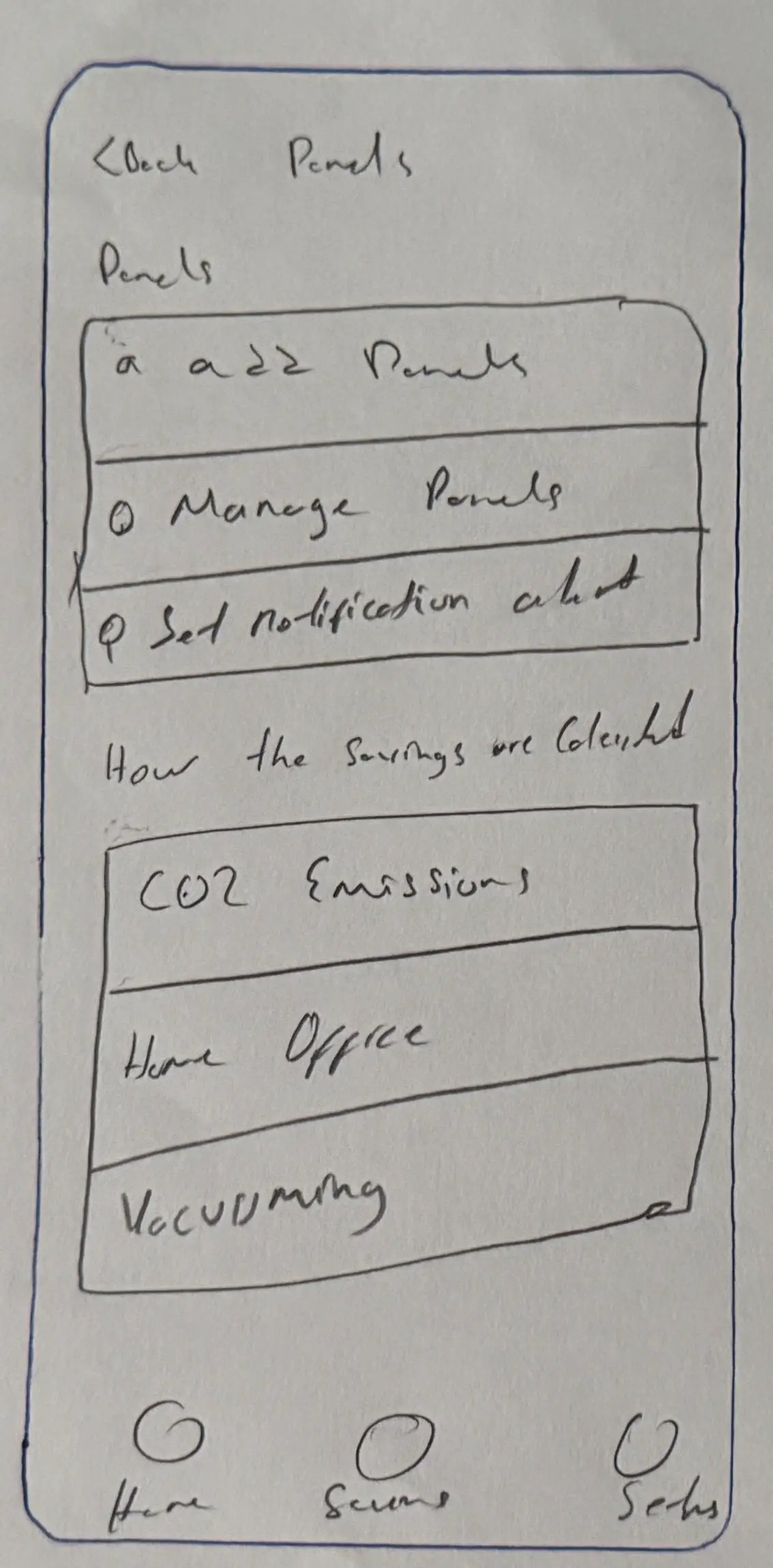
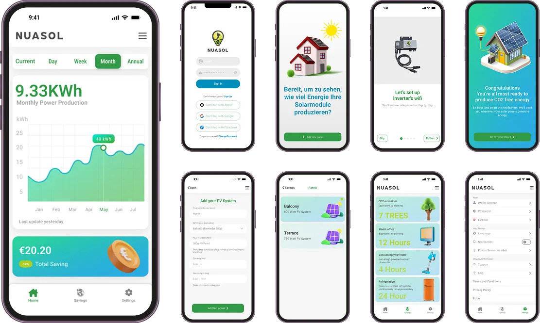
I began with paper wireframes to map the key screens and flows quickly. The welcome screen gives a smooth introduction, the “Add panel” flow simplifies setup, the home screen shows a clear energy overview, and the CO₂ page visualises savings.
A deliberate trade-off
We skipped low-fidelity digital wireframes to meet the tight timeline for Version 1, and focused on the essential screens.
Design system & UI kit
To keep the interface consistent and speed up development, we built a modular, scalable design system covering typography, colours, components, icons and data visualisation.
Colors
Typeface
- Large57/64 · 0
- Medium45/52 · 0
- Small36/44 · 0
- Large32/40 · 0
- Medium28/36 · 0
- Small24/32 · 0
- Large22/28 · 0
- Medium16/24 · +0.15
- Small14/20 · +0.1
- Large14/20 · +0.1
- Medium12/16 · +0.5
- Small11/16 · +0.5
- Large16/24 · +0.5
- Medium14/20 · +0.25
- Small12/16 · +0.4
Display and headline styles for prominent values; title, label and body styles for system data and actions, with sizes, weights and spacing chosen for readability on mobile.
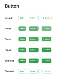
Buttons
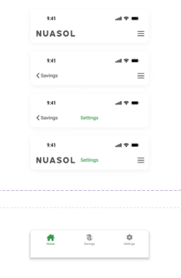
App bars & tab bar
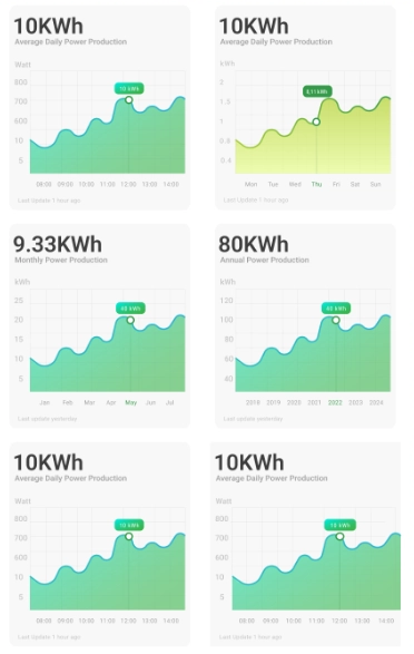
Data visualisation
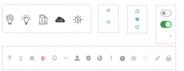
Controls & icons
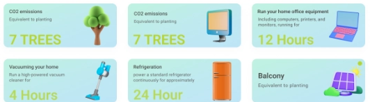
Illustrated cards
Components & states
Buttons, icons, navigation bars and inputs with clear default, hover, focus, pressed and disabled states, so every action gets feedback.
Data visualisation
Simple line charts for daily, monthly and annual output, with soft gradients and minimal clutter to emphasise trends.
Contextual illustrations
Friendly visuals show what the energy equals, such as running a vacuum cleaner, a refrigerator or a home office, so abstract numbers become tangible.
The result: reusable, accessible and developer-friendly UI elements that kept the experience cohesive and sped up implementation.
From Version I to Version II
I iterated on the high-fidelity screens. The second version moves to a green palette, adds illustrated onboarding and the CO₂-equivalence cards, and gives the home screen a clearer production chart and savings card.
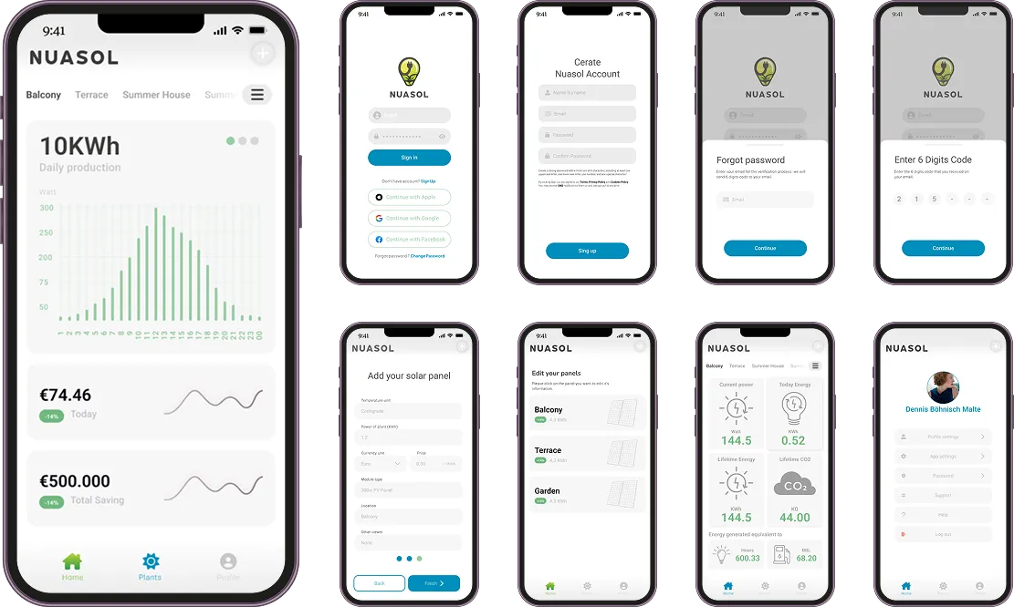
Results & reflections
- Fixed installation confusion, unreliable login and missing feedback.
- A real-time energy production alert system, so users can use peak solar generation by scheduling power-hungry devices.
- A clean, accessible app used across multiple regions and languages.
- Removed micro-interactions and some visual polish to meet development timelines.
- Skipped low-fidelity wireframes for Version 1.
- A QR-code setup with a visual step-by-step walkthrough.
- The company stopped investing in Nuasol and switched to the inverter manufacturer’s app.
- European solar incentives shifted, slowing demand.
Reflection
Despite not building everything we envisioned, I believe we shipped a thoughtful, high-impact product that solved real user problems. It was a valuable lesson in working lean, adapting quickly and designing for clarity under pressure.